Good design should hurt a little
|
Hey pumpkins, Over the weekend I soft-launched a totally rebuilt bitsandletters.com, with a long essay detailing the process of designing and coding the new site with substantial help from, yes, AI. I won't spend valuable inbox time recapping that here; check out the site and post if you haven't yet. It's always dangerous to say what "design" is or isn't on the public internet. Even if you're right, the ghosts of Design Twitter will find you and haunt you and say actually it's the opposite of whatever you said. But, having spent months struggling to get a new website and story buttoned up, only to eventually let go and let One can't go wrong looking to Dieter Rams' ten principles of good design for definitions and guidance. Rams writes that good design is honest, a simple word that can imply a lot. What Rams meant was: [Good design] does not make a product more innovative, powerful or valuable than it really is. It does not attempt to manipulate the consumer with promises that cannot be kept. He also wrote that good design is thorough down to the last detail: Nothing must be arbitrary or left to chance. Care and accuracy in the design process show respect towards the user. Other principles say good design should be aesthetic, should be innovative, should make a product understandable — all true. The thing with this framework is you can't cherry-pick the ones that are easy, ignoring the others, and still call a design good. Here, Rams is saying good design aims to achieve all of them. Honesty and caring can be hard. Sometimes, the honest choice — and the self-reflection and broad insight necessary to make it — hurts a little, and that little bit of pain can indicate the difference between design and slop. That's to say: good design should hurt a little. "Hurt" is another simple word that implies a lot. What I don't mean is: Effort for effort's sake. A lot of current design trends — glow borders, shaders, mesh gradients — look more "crafted" because they're simply harder to produce, and often (from a CPU/GPU standpoint) harder to render. And that's just the human-made stuff. We find ourselves in an era where maximalism doesn't cost anything, and so much of what we see is remixing with no actual decision-making or thought behind it. Placing unnecessary demands upon the user. I'd point out that some of the biggest AI-era brands — OpenAI, Anthropic, Vercel, Cloudflare — are still safely in the pocket of Big Swiss Modernism, with Anthropic mixing a bit of literary flair in with the boxes, grids, and hairlines. It's the upstarts like Nous Research (who make Hermes, an open-source agent harness) or Anomaly (makers of OpenCode, an open source AI coding tool) who're too cool to pick one logo and stick with it, or use type below poster sizes on their desktop website. There's so much discussion these days about "the moat" — i.e. what, if anything, protects a business or career from being annihilated by AI now or in the near future. Some say distribution is the moat. Others say taste is the moat. I'm in the same camp as Charlie Marsh, a developer at OpenAI, who tweeted this week that caring is, in fact, the new moat:
In his list of principles, Rams frames good design in terms of honesty, keeping promises, showing respect — all intrinsically human qualities that are not always easy in practice, and ultimate represent ways that good design is an act of caring for people. As happy as I am with how the version of B&L's brand Claude helped assemble came out, AI-assisted design can easily go the other way if you don't insist on a coherent point of view as part of your input to the machine. High on a week of shipping weird AI stuff, yesterday I decided to see how Claude would handle a new design system for my personal site, with me providing color and typography direction but much less specific data and prior art to work from. The results were uninspiring — shouty all-caps text, color contrast that failed both WCAG guidelines and tenets of good taste, incoherent hierarchy, and of course, gratuitous numbered lists and eyebrow labels. I'm still broadly a convert to tools like Claude Design having a role in my design process, but I've also had to learn and re-learn that AI-assisted design isn't easier, it just shifts and reshapes the effort from clicking around a Figma canvas to thinking — sometimes really, really hard — about how to describe what you want in sufficient detail that the robot can't mess it up, which is its own source of mild pain. Speaking of painIf one image defines small/indie agency life this year, it's this one:
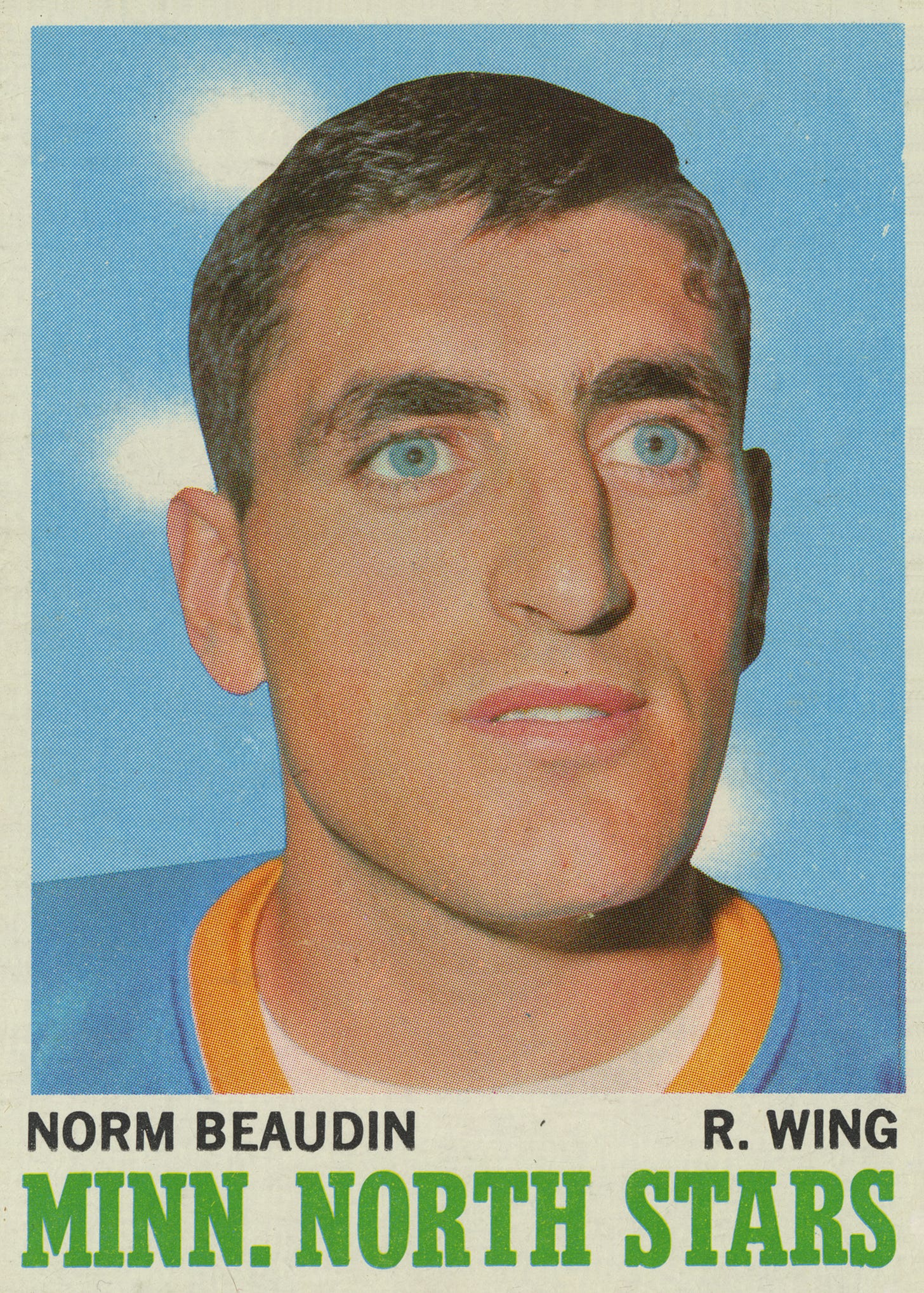
Every few weeks, someone in an agency group I'm in — possibly me, but sometimes someone else — will post asking "hey, is new business dead for anyone else? Or is it just me?" Earlier this year, someone in biz-dev at a larger shop might Kool-Aid Man into the chat saying "nah man, we're having our best year ever!" But someone else at a solo studio or small agency would often meekly put an emoji on the original post, or pipe up saying they too had seen new business fall to nothing. When agencies have seen glimmers of hope — a week or two of more inbound leads, or what seems like a really promising big engagement — all of a sudden the clients will ghost, or come back asking if they can have half the work at a quarter of the price, "because AI." I keep coming back to something I wrote on LinkedIn over the summer (and talk about on video here): we're in a trust recession, in that people who might hire a service provider to design or build something are instead focused on keeping their powder dry, and a confidence bubble in terms of people feeling AI empowers them to DIY rather than choose between "pay an agency" or "do nothing". Because nothing can be simple, the trust recession has knee-capped new business for many agencies, but I've also heard from folks who have long-term client relationships that those relationships are holding steady or even growing. Sure, some of those clients are asking for speedier, cheaper delivery (because AI), but prior relationships and trust are proving to be resilient. It's businesses that depend on new projects coming in the door (via web searches, referrals, etc) that are struggling. Interestingly, one of the Kool-Aid Men in one of these communities recently posted that they're finally seeing a major drop in inbound leads — not to zero, but 30-50% below the prior quarter, and way below what they'd expect going into Q4. Their web traffic and even search metrics are normal, so it's not that Google AI Mode is killing discovery, or that clients are using AI instead (presumably, folks using AI for marketing/creative work would not be Googling marketing agencies). What this has to do with the B&L website reboot is that, in the absence of all the usual ways people used to find and hire firms like mine to help their businesses, clarity and speed are utterly essential. The old website was telling an okay story in an okay way; okay stories are probably not good enough right now. This may improve if/when the economy improves, but seems likely to get even worse before it gets better. And on that cheery note: Some links worth readingOver the Topp — Elizabeth Goodspeed collected a lot of vintage Topps sportsball cards, with some of the most creative, unhinged typography and illustration choices you'll see all week.
Heeeeere's JohnnyLast year the dudes who make Delta, the popular iOS retro video game emulator, released a beta of Delta Camera for their Patreon subscribers, an app which hooks up a Game Boy emulator to your phone's camera, so you can take pictures with the old Game Boy Camera. This week's Johnny portrait comes from that app, upscaled from the original 400x320 postage-stamp size for modern screens. |